Taco Cheesington
A Responsive Recipe Page That Brings Their Signature Street Tacos To Life
Objective
Taco Cheesington, a street taco company, wanted to showcase one of their signature recipes online for home cooks and food enthusiasts who enjoy discovering and recreating their dishes. The goal was to create a responsive, visually appealing webpage that could adapt seamlessly across devices while highlighting the company’s recipe and brand.
The content and wireframes were provided, and the goal was to produce a modern, accessible, and visually appealing webpage that could adapt seamlessly across devices for the target audience. Since most users access the site on smartphones, the design followed a mobile-first approach. The webpage required semantic and validated HTML, CSS for typography, shapes, SVGs, dimming and blurring effects, transitions, and a media query for print.
Synopsis
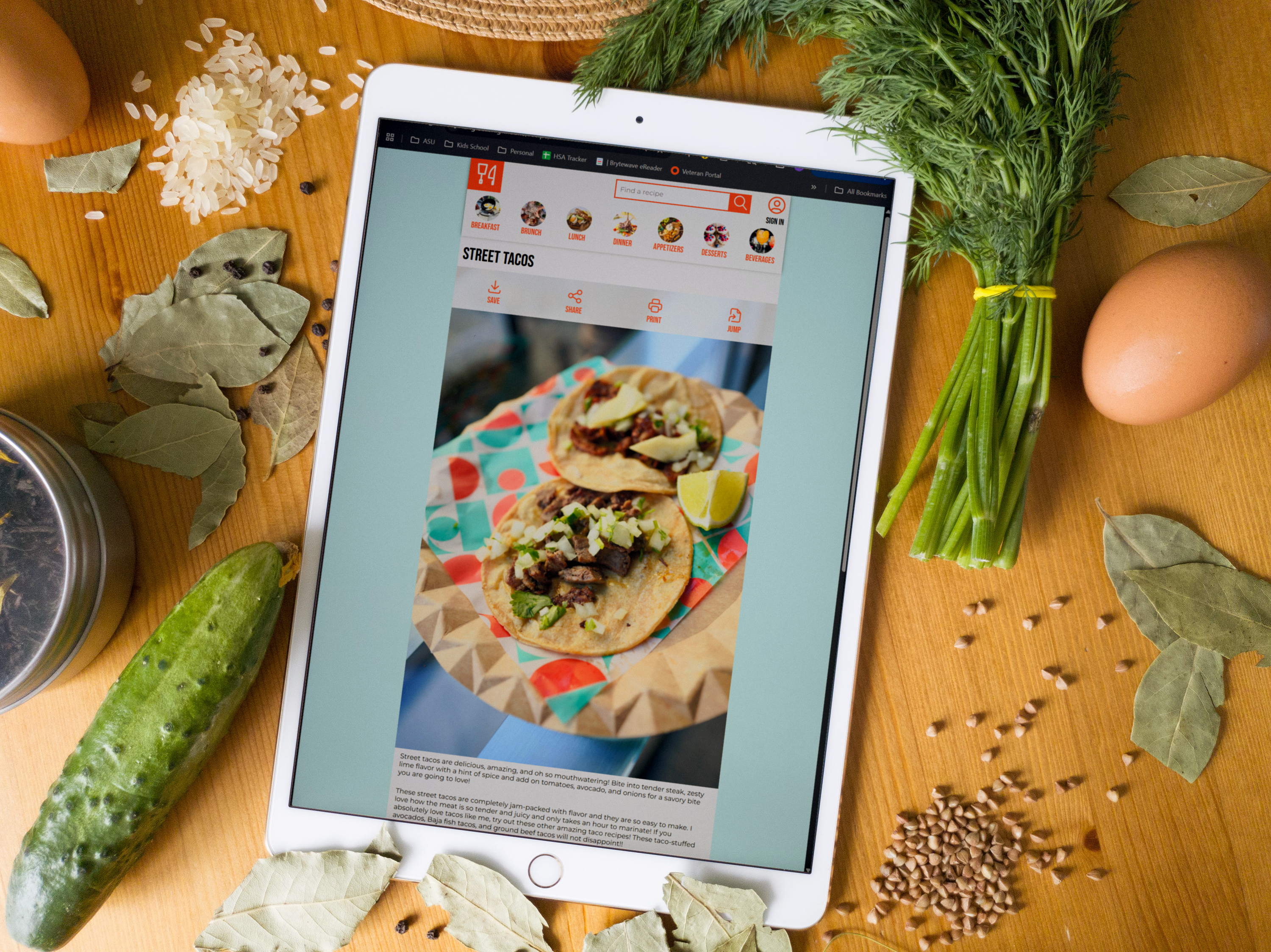
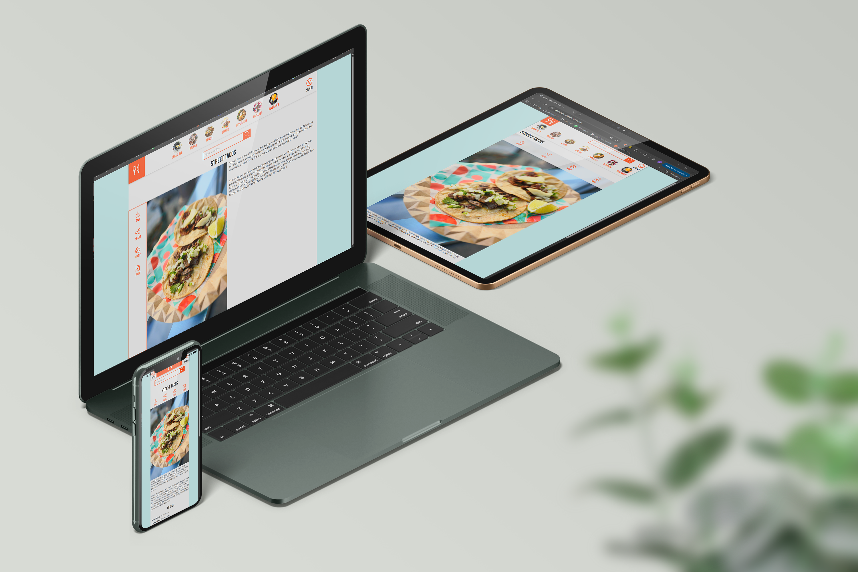
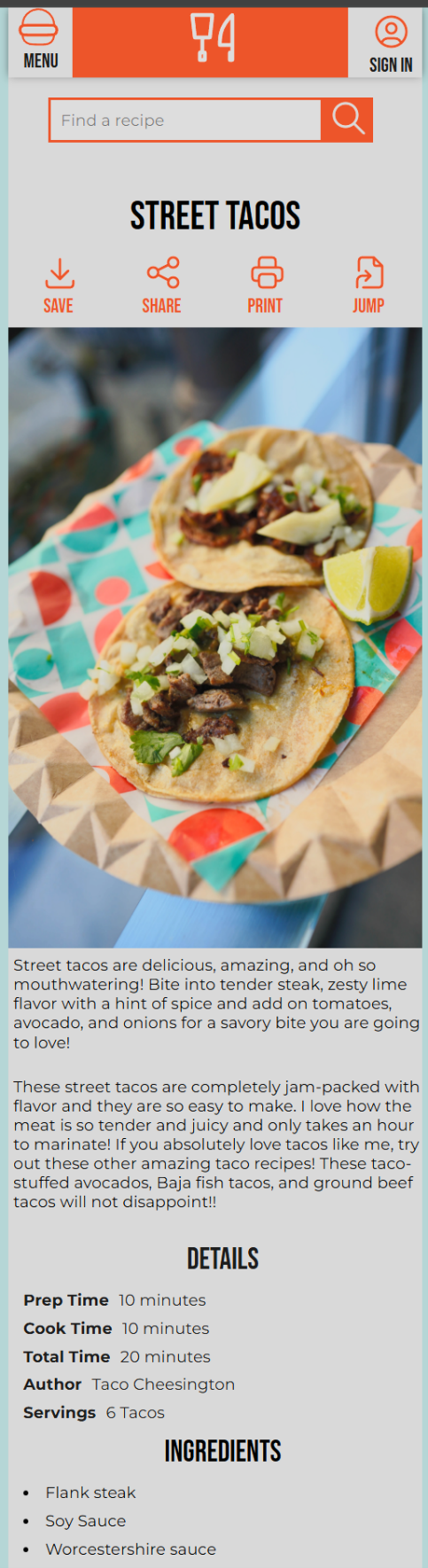
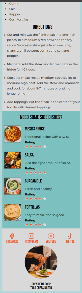
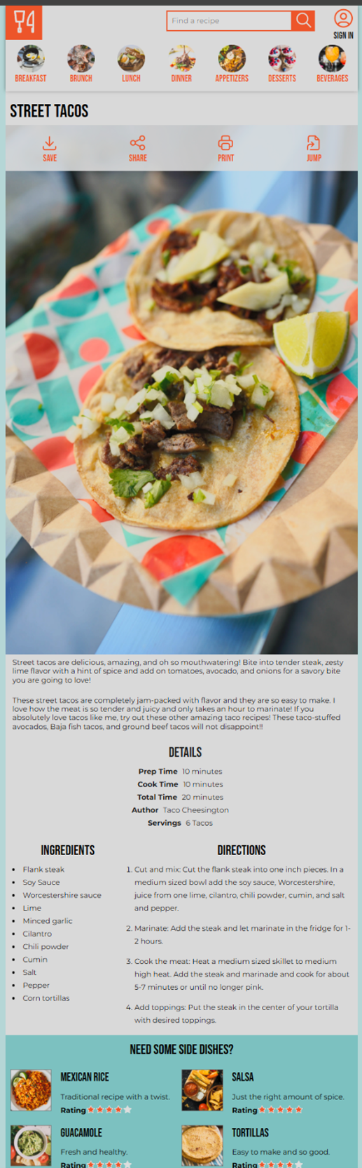
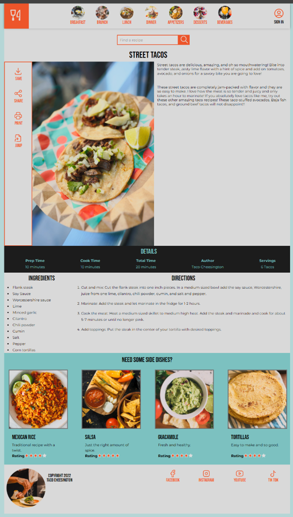
This webpage is similar to modern recipe cards commonly found on food websites. It features a large image of the finished dish, an introduction, and sections for details, prep time, cook time, ingredients and the directions. Users can also save, share, or print the recipe. The webpage is fully responsive and adjusts to three different media query sizes, ensuring accessibility on smartphones, tablets and larger screens such as laptops or PCs.
Process
With the content and wireframes provided by the client, I focused primarily on coding. I began with a mobile-first design to ensure that the page would perform well for the majority of users. This approach allowed me to prioritize essential content on smaller screens before scaling up. Once the mobile layout was complete, I adjusted the layout and styles for tablets and desktops, defining breakpoints and visual hierarchy to maintain usability and clarity.
After the initial build, I reviewed the code multiple times to simplify and combine elements, improving efficiency and maintainability. Extensive testing and CSS refinement ensured consistent functionality, accessibility, and a polished visual experience across many screen sizes.
Results
The project was completed on time and met all requirements. The final webpage matched the wireframe exactly, showcased Taco Cheesington’s signature street taco recipe, and was fully responsive across multiple screen sizes. Users can easily view, save, share, or print the recipe, providing a seamless and enjoyable experience across devices. All requested visual and interactive effects were implemented successfully, enhancing engagement and strengthening the brand’s online presence.
The webpage can be viewed here:
Taco Cheesington Recipe
Project Mockups and Images